Home    Macro Writing    Design    Data Visualization     E-Publishing     Innovations     Samples     PNNL     LaTeX Training     About      Contact      


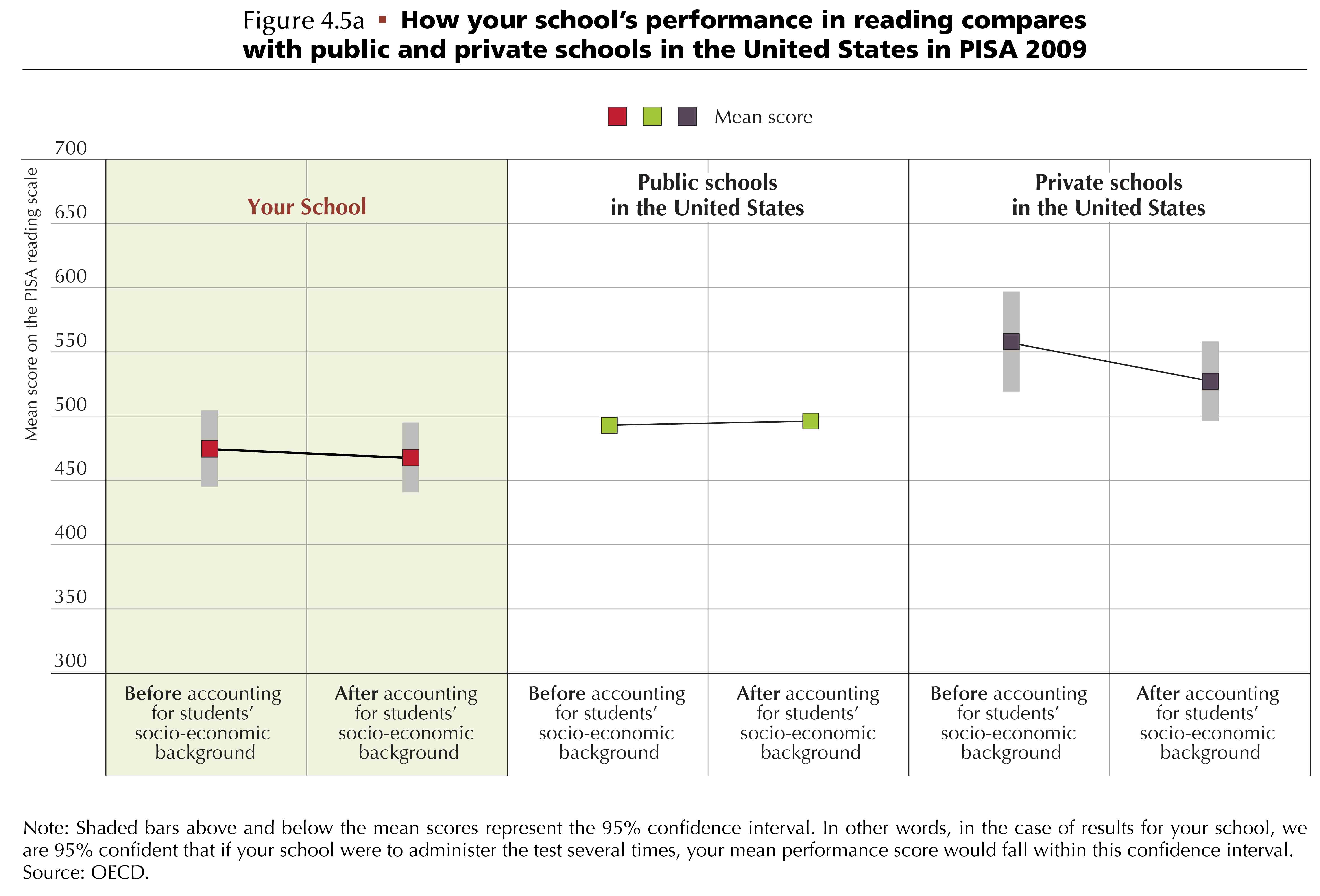
Automated translation of data to graphics:
Combining LaTeX and TikZ to produce on-the-fly
data-driven customized graphics


The series of examples below exhibit parts of customized reports for the OECD Pilot Trial results:
"How Your School Compares Internationally"
Commissioned by CTB-McGraw-Hill and implemented
in LaTeX/TikZ by TeXnology.


  • The goal of this project was to automate the production of 500
    or more unique e-books, each e-book showing results for one school. Data for each school was supplied as Excel .csv files.


  • The sophisticated design, developed in France, was originally implemented
    in InDesign. You can see the original complete booklet here. Our version
    of the complete booklet shown here, was programmed entirely in LaTeX and
    Tikz, with the inclusion of pdf graphics.

  • Each e-book has 162 pages, including 52 illustrations showing data for the school using various data visualization methods:

    And more, as you can see below. The positioning of the data markers is automated.


Bar Graphs: The bars are drawn with TikZ, with the height determined by the data for each school. Notice that the striped bars indicate that the data for `your school' is statistically significantly different than the distribution of students in the US.

LaTeX must test the data for the particular school and provide either solid bars (top graph) or striped bars (bottom graph), depending on the results. The results for two different schools are shown here.


Summary Graph: The background of this graphic was taken from the original .pdf; the markers originally in the left column were erased in Illustrator; then the markers for the school under consideration were added, and positioned according to the data for that school:


Bubble Graphs: Done entirely with LaTeX/TikZ, these were definitely difficult to implement. Doing so involved using a loop in the macro that will continue only as long as there is a definition that matches the bubble counter; the bubble counter is advanced every time a new bubble is drawn. This system accomodates the differing numbers of bubbles used in separate bubble graphs. TikZ was used to draw the circles and to change their size and position based on the data for each school. Each bubble is positioned on its own layer then superimposed in the graphic.


Triangle Markers: The tricky part of this graphic is that the color of the triangle must change to a darker color if the data given for `your school' is statistically different from schools in the US generally. LaTeX must make this calculation after using the definition of `statistically different' and checking to see if the data given is outside of the range of the confidence interval. Here are results for two schools, where you can see that the triangles that are further from the bar have been changed to green.


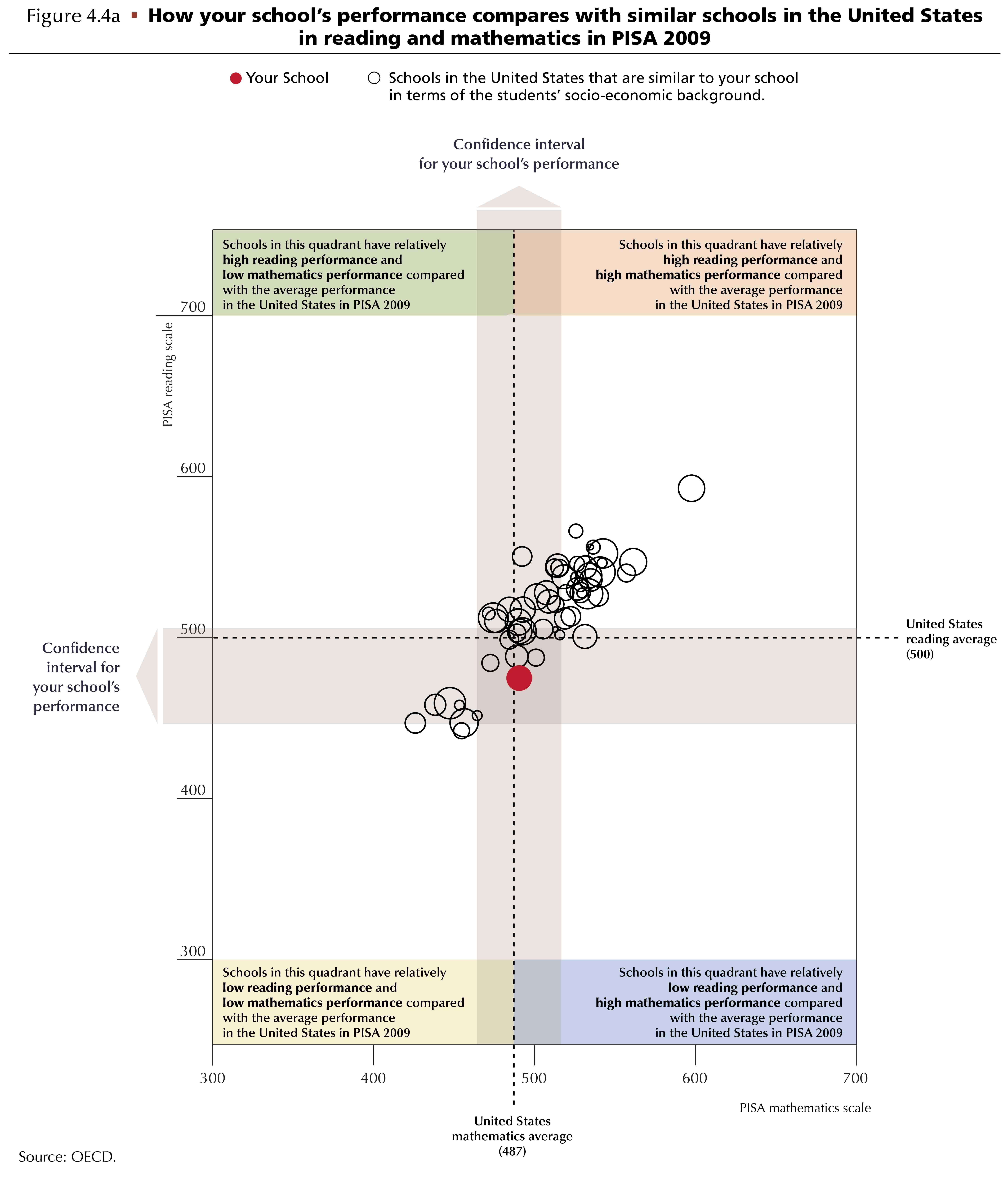
Horizontal Bar Graph: Here, again, the color of the horizontal bar must change if `your school' is statistically different from those of the United States in PISA 2009. This involves use of the Confidence Interval to make the determination, and again is implemented entirely in LaTeX.


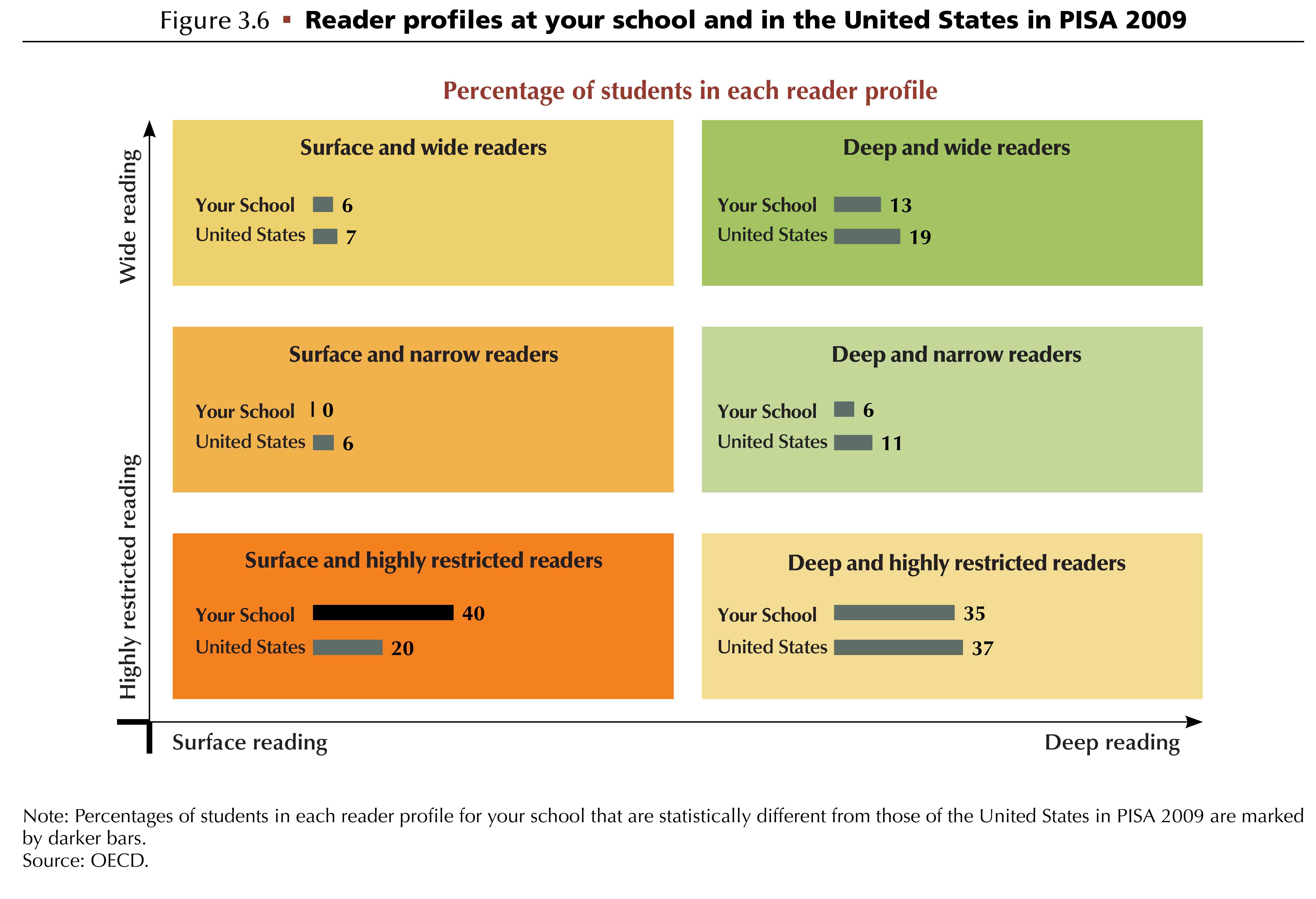
Bar graph using colors of varying widths: Another kind of horizontal bar graph. In this case the bars in the lower part of the graphic are the same across all schools, and only the upper bar must be changed to reflect the current school's results. The data determines the position and color of the parts of the top bar:


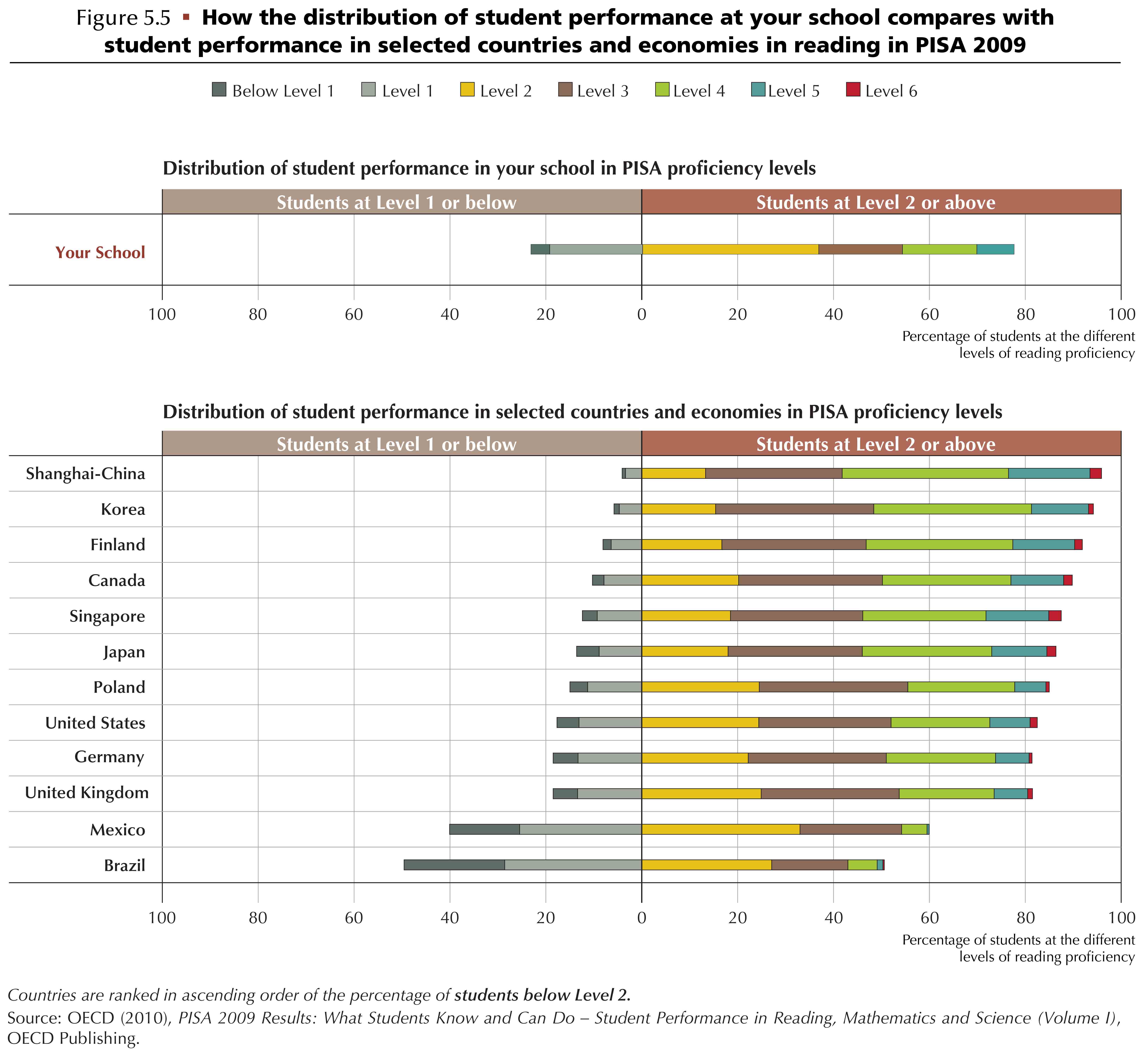
Slanted Lines Drawn on the Fly: In this graphic, the horizontal bars must be positioned according to the data for a particular school, then slanted lines must must be individually drawn to go from the center of the left red marker to the center of the right red marker. The positioning and slant is determined with TikZ.


If you'd like to understand our process of translating data into graphics in more depth, you will find an explanation here. Click on the link below:
Speaking TeXnically


-
The elegant design implemented here in LaTeX suggests that there are few limitations on the visual language that may be used in a LaTeX document.

- The ability of LaTeX to use math to determine whether a number was within the confidence interval, and to change the color of the given marker depending on the answer, is a tool that could be used in other contexts as well.

- These examples show the ability of LaTeX/TikZ to produce data driven graphics on the fly--a capability that may be put to many uses, including on-line report generation, bioinformatics, and more.

Amy Hendrickson
amyh@texnology.com
617 738-8029